MetaData Tab
The MetaData Tab allows you to visualize, filter, and export high-level metadata extracted from your nanopore event database. These metadata attributes include fields such as event duration, maximum blockage, sublevel statistics, conductivity, and more. Plots help explore trends, distributions, and relationships between these features.
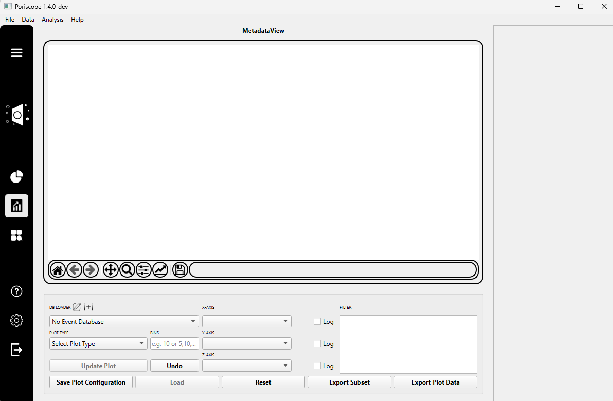
Step 1: Load Metadata Database
Click the ➕ Load Database button to import a fitted events database.
A plugin dialog (e.g.,
SQLiteDBLoader) will appear. In this dialog:Enter a custom Name for the loader instance (e.g.,
SQLiteDBLoader_1).Click Select Input File and choose a valid SQLite .db file previously generated by the Commit function.
Note
Only databases that contain fitted events metadata are compatible with the MetaData Tab.
Step 2: Choose Plot Type and Configure Axes
From the Plot Type dropdown, select the type of visualization you want to generate. Options include:
Histogram
Kernel Density Plot
Capture Rate
Heatmap
Scatterplot / 3D Scatterplot
Raw Event Overlay / Filtered Event Overlay
Raw All Points Histogram / Filtered All Points Histogram
Define the number of bins for your plot:
Use a single number for 1D plots (e.g.,
50).Use two comma-separated values for 2D plots (e.g.,
50,50for a heatmap).
Choose the X-axis and (if applicable) Y-axis and Z-axis attributes. These correspond to metadata columns in your database such as:
start_time,duration,event_idbaseline_current,max_blockage,sublevel_stdevvoltage,conductivity, and many more
(Optional) Enable the Log Scale checkbox to apply logarithmic scaling to the selected axis.
Note
The axis attribute menus are dynamically populated based on the metadata fields present in the loaded SQLite database.
If you want to inspect the structure of your database manually, you can use a SQLite visualizer such as:
Step 3: Apply Filters
You may apply filters to visualize only a subset of events or sublevels.
In the Filter box, enter a simple condition to narrow down the results using a simplified SQL-like format.
Examples:
duration > 200max_blockage < 600 and num_sublevels >= 3voltage = -200 or sublevel_stdev > 5
You can use the following operators:
=,!=,>,<,>=,<=Note: No need to write full SQL — just simple expressions like
field = value.
Supported operators:
Comparison:
=!=>>=<<=Logical:
andorJoin:
Warning
Invalid expressions or typos in field names may result in no data being displayed.
Step 4: Generate and Export
Once plot settings and filters are configured, click Update Plot to visualize.
You can then:
Save Plot: Export the current figure to disk (.png, .svg, etc.).
Undo: Revert to the previous state.
Load: Restore a previously saved plot configuration.
Reset: Return to default settings.
Export Subset: Save the currently filtered data to a new file for external analysis.
Tip
Use “Export Subset” to isolate and save only the events that meet your filtering criteria. This is ideal for downstream machine learning or further statistical analysis.